I’m Seeing Spots!

This blog has mostly instructional posts with images and videos of things related to photographic retouching. I’ll be doing this type of post for those learning the process, in addition to other things of more general interest to photographic presentation, history and art production.

I’m looking forward to this new adventure!


Website and all images by Garrett Nichols, ©

Water and Paper, Pt. 1

The other two main components of your basic tool kit for traditional print retouching are water and paper.

Water

The water is to dilute the spotting dyes in order to produce the necessary shade. It’s very important to make sure to only use steam distilled or deionized water. Both types of purified water have all the dissolved minerals removed, just by different methods and for our purposes, are identical. Tap water is not a good choice for a couple of reasons. One is the chlorine that is found in most municipal water supplies, as it can interact with dye colors in peculiar and unpredictable ways. The other is the dissolved minerals. Iron, especially, can react with dyes over time and create a green cast. Other minerals like Calcium and Magnesium can leave a dusty white residue on the surface of the print as the water evaporates.

Your work should be invisible!

The water acts as a solvent for the dyes and needs to carry them into the emulsion of the paper. Once the water has done that job, it needs to evaporate completely and cleanly without any residue of any kind left on the surface of the print. You don’t want to leave any traces of your work behind for someone to see. Remember, your job is to fix things, not create more problems. If someone can look at your finished print and identify where you did your work, you need to work on your technique.

The best compliment you can receive is for the client to say that the print looks great, but they can’t tell where you did any work. (They’re not supposed to!) Sometimes, a before and after snapshot is a good idea for those clients that may have a hard time paying you for something they can’t see. What they’re paying for is all the original spots they can no longer see—they should never see the work you did that got rid of those spots.

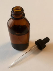
I keep a small bottle with an eye dropper in the lid with my spotting kit and only fill it with distilled water. Try not to contaminate your water with anything. Keep it pure.

Next post, the dos and don’ts of paper.

Setting Up Your Mixing Plate

I find that the best mixing plate is just a simple white porcelain dessert plate, about eight inches in diameter. I think I paid $2.99 at CostPlus World Market. Many spotting kits come with a cheap plastic plate with several wells for water or color or something. Right off the bat, plastic is a non-starter. Dyes and water will just bead up on plastic and make things difficult. Also, I like to partition my plate so I can have multiple shades ready for use, but all properly labeled so I don’t mistakenly use the wrong color on a project. Plastic won’t allow you to draw lines or write letters.

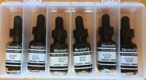
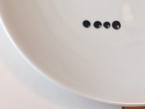
Step 1: measure out the right amount of dye for the formula you are using. Don’t use full drops of dye as that is usually way too much. I just have about 1/4 inch of dye in the glass dropper and then just touch the tip to the plate. That will deposit a small and repeatable amount of dye.

Step 2: Mix the different colors thoroughly so you will have a consistent color for the duration of use.


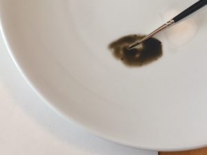
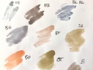
Step 3: Test the color on your paper. The paper serves three purposes: the first is to test the color, the second is to sharpen the point of the brush hairs and the third is to remove excess water. You always want to use a relatively dry brush since one with too much water can be uncontrollable.

Step 4: Draw a line with your brush to partition off this area of your plate and label this area with the name or code you have established for this color, whether it’s a standard color or a custom mix.


Brushes

Choosing a good brush is very important, as a bad brush can make your spotting job impossible. Look for a good watercolor brush with natural fiber. The nylon and synthetic fibers just don’t seem to give you the control you need. My favorite brushes are Winsor and Newton, Series 7, made from Kolinsky Sable. Even when I’m shopping for those, I’ll take a loupe with me to check the tip. Make sure all the fibers come together into a nice clean point with no stray hairs and no odd curvature to the tip. It needs to be straight so you know exactly where the dye is going. Most good stores will have a bit of water so you can dip the brush and examine it wet. They’re too expensive to buy without testing them out a bit.


These are a few of my brushes.

I usually find myself using a 00 for most things, but a 000 also works very well. If you are working on a large area of all the same shade, then a 00 will hold more dye and you can work faster. If you’re in an area where you are constantly changing densities, a 000 is faster for that kind of work. I use a 0 for applying just distilled water if needed, but I never use it for dye. I know some people that use a 0 for spotting but I find I can control the amount of dye more easily with a smaller brush size, 00 or 000. To each his own. Get a selection of various sizes so you can find the one that works best for you.

This image shows the relative sizes of three different brushes. 000 at the top, 00 
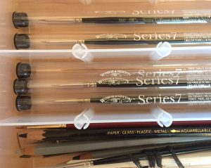
in the middle, and a 0 at the bottom, although the markings have worn off from use.

First Things First—Dyes.

You will need spotting dyes. There are a few companies that still manufacture them, and you can try them and see if they work for your purposes. Good dyes will soak into the emulsion and leave no trace of residue on the surface of the print. They will also mix easily to make new, intermediate shades. Test any new dyes with at least those two ideas in mind. As traditional silver-based imaging becomes less common, so do the manufacturers of the necessary tools. Keep an eye on places like Ebay for dye colors that aren’t currently being made. I’d have no problem buying a used bottle of dye since they last forever, and some of the older dyes are actually better than the newer versions. My favorite brand is Marshall’s retouching dyes, and to get a full set, you may need to look around a bit, but it shouldn’t be impossible.

This shows a few of the most common dye colors I use frequently.

This is what I would consider a complete set of Marshall’s Photo Retouching colors:

Basic Grey

Basic Black

Neutral Black

Blue Black

Brown Tone

Selenium Brown

Olive Tone

Bright Orange

The first place to start on your quest for a set of dyes should probably be B&H Photo in New York. They have a starting set that you can add to as you find missing colors.

If you happened across an old set of Spotone Dyes, a reasonable starting set would include:

#1, Blue Black

#3, Neutral Black

B, Brown Tone

S, Sepia Tone

O, Olive Tone

They work just fine, although, out of the bottle they are not as concentrated as the Marshall’s. If you need a darker shade than the straight liquid will produce, just smear a little on your plate and let it dry. When you then wet it again with a tiny amount of distilled water, it will be as concentrated as you could need.


Where To Start…

In order to make any kind of informed decision as to the color of the dye you’ll need to mix for any black and white print, you first need to know what the dyes you are starting with actually look like. You can’t tell when they are wet, so make a sheet with a smear of each color you have, label it, and let it dry. You’ll use this sheet all the time so keep it safe in a folder with other important spotting notes and samples. You may want to make another sheet with smears of some of the more popular mixes you tend to use.

This is my basic color sheet. I can create just about any shade I may need in order to match a print starting from these standard dye colors. These are all Marshall’s basic colors except for “B,” which is a mix that I use all the time.